Remedy
-
Problem
In an oversaturated beverage market, health-conscious consumers often struggle to find products that combine visual appeal with an authentic wellness message. Competing brands either focus heavily on minimalism or loud, flashy designs that don’t always align with the holistic, natural values of their audience. The challenge lies in creating packaging that:
Conveys wellness and natural ingredients effectively.
Stands out on shelves with a unique aesthetic.
Attracts target consumers who value botanical, clean, and organic products.
-
Solution
To address this, the design solution focuses on:
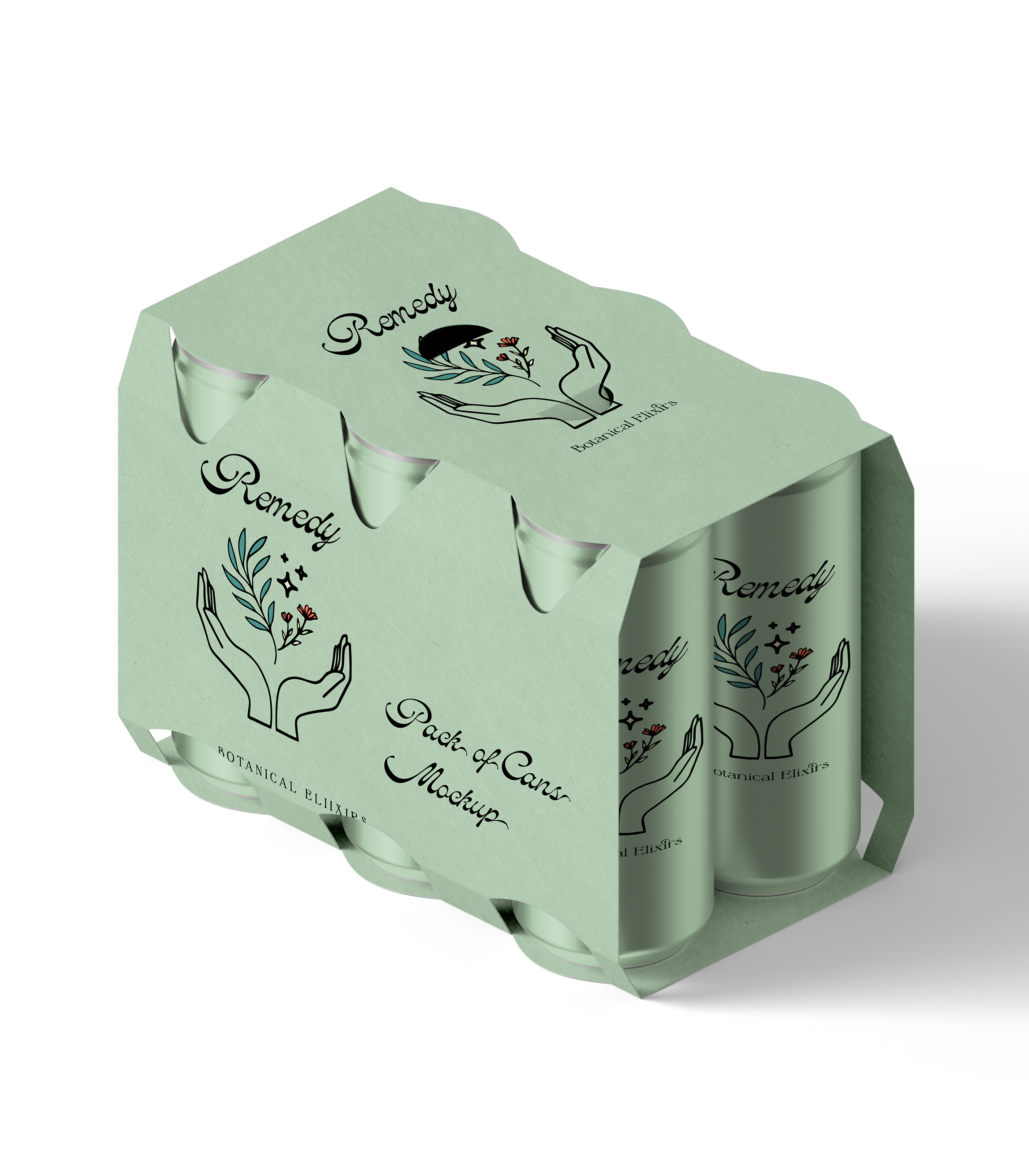
Soft Gradient Color Palette: Inspired by nature (blues, greens, and warm earth tones), the palette evokes calm, balance, and harmony—core values of botanical wellness products.
Elegant Logo and Illustration: The design features a delicate illustration of a bowl with flourishing botanicals and hands, symbolizing nourishment, care, and natural growth.
Consistency and Variants: By maintaining a cohesive design language across three color variants, the product line feels unified yet distinct, appealing to different tastes and use cases such as relaxation, focus, or energy.
Premium Typography: The serif “Remedy” logo conveys a sophisticated yet approachable tone, appealing to an audience seeking a premium botanical experience.


